A completely redesigned version of Scout Camera for iOS 7 was released today. While many of the changes are cosmetic – to match the distinct look of iOS 7, there are a few other nice improvements that make this a great update.
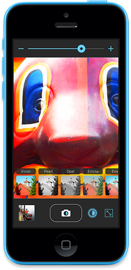
The biggest new feature is a slider that lets you adjust the intensity of the current image filter. For most of the filters, adjusting the slider down will lower the intensity of the filter – bringing the image closer to what it looks like naturally (bringing the slider all the way down still shows some filter effect).
The “Pearl” and “Nora” filters behave differently though… for those, adjusting the slider down mixes the filter effect with a standard grayscale image conversion. For “Pearl”, that means a nice range between the high contrast black and white when used at full intensity – and a more standard black and white conversion. For “Nora” it gives a pleasing range of deep blue/gold to black/white tones.
That small addition to the app provides a huge array of possibilities, and I’m looking forward to seeing the great photos people take with it. On top of that, many of the filters have been improved to have a better overall look.
Other improvements to the app include:
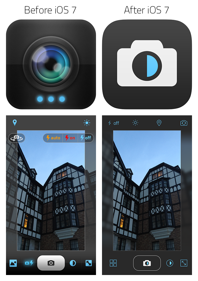
a nice new app icon
new “color blur” and “grayscale blur” crop border styles that match the blurred background style of iOS 7 (on iPhone 5, iPad 3, iPod Touch 5th gen and newer devices only)
a new layout for the flash and front/back camera select controls, which provides easier access to those controls on newer 4″ screen devices
larger thumbnail images in the photo browser
lots of user interface tweaks, and a couple of small bug fixes
I should mention that the app runs only on iOS 7 and up now… not a problem for most, but if you’re using an iPhone 3GS I’m afraid you’ll need to stick with the previous version of Scout Camera. Also, I’ve chosen to make it a free update rather than offer it as a new app in the App Store.
All in all, it’s a great update. If you haven’t purchased Scout Camera, I hope you’ll check it out… it’s fun to use, and might just be your new favorite camera app.
Prior to writing her review of Scout Camera, Marianne Schultz of AppShopper asked me “Why did you want to create a photography app (given the large number of photography apps already in the App Store)?”
This post is an expanded version of my response to her, explaining why I made Scout Camera – and why I think it makes for a better photography experience.
I love photography… so much that at one point I strongly considered becoming a professional photographer, but quickly realized that it would require too much time away from my family. Though I’m not a very prolific photographer, I think I do occasionally take a decent photo.
Given that love of photography, it was natural for me to want to make a camera app.
I really enjoy the process of taking photos – and being able to frame a picture to a particular aspect ratio while taking it is, to me, a better experience than taking a photo and cropping it later on. If you carefully compose a picture while in the process of taking it, rather than taking a quick shot and cropping it later, you’ll end up with better photos – and you’ll become a better photographer overall. I think this is something most photography enthusiasts would agree with me on. For that reason, I wanted to make a camera app that offered a choice of aspect ratios.
I also really like the 16:9 aspect ratio. I find that particular shape of photo visually interesting, and wanted a camera app capable of that. Years ago, I discovered some fantastic 16:9 photos on the DPReview.com forums taken by photographer/architect Björn Utpott with his Panasonic LX1 camera – so my desire for a 16:9 camera app was also partially inspired by him. (I wish these photos were still around, but I can’t find them anywhere… his newer photos are taken with various cameras and mostly not in 16:9, but are still great). The ability to take photos in 16:9 ended up working well with the iPhone 5 when it was released – it’s nice viewing those photos on the iPhone 5’s 16:9 screen.
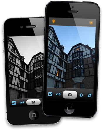
A 16:9 photo taken with Scout Camera
One issue I have with other camera apps is how some of the controls block the view of the photo you’re trying to take (like the typical front/back camera switch and flash on/auto/off buttons). In other camera apps, I find those controls distracting and think they get in the way of composing the picture. So, with Scout Camera I decided to make those controls only show when you need them.
Another problem with certain camera apps is how they try to look like traditional cameras and emulate their controls. I wanted something with a clean, uncluttered interface – something elegant that looked like it belonged on an iPhone, not a poorly translated rehash of DSLR buttons and menus.
Scout Camera’s clean, uncluttered interface.
I also wanted to be able to offer something that allowed you to take photos in black and white, or that had a little extra color saturation – or a number of other visual looks… and I wanted to be able to see what those effects looked like as I was taking the photo. There are some really great image filters included with Scout Camera, and there’s still a lot more I want to do in that area.
In many ways, I think Scout Camera makes the process of taking photos more enjoyable, and can even help you take better photos. While the app runs on anything from an iPhone 3GS on up, it really shines on an iPhone 5. In fact, I think it’s the best photography experience available on the iPhone 5 and I hope you’ll give it a try.
Yesterday Daring Fireball’s John Gruber reported his findings that Apple’s built in Camera app on the iPhone 5 was capable of using ISO speeds up to 3200 – while 3rd party apps seemed to be limited to ISO 800.
This was troubling news, and I reached the same conclusion in my own testing.
However, after posting a thread (developer login ID required) to the Apple developer forums I’ve learned that 3rd party developers CAN take advantage of this special “low light boost mode”. (Thanks Apple!)
While it’s not documented yet in the AVCaptureDevice Class Reference, taking a peek at the “AVCaptureDevice.h” class header reveals the related properties:
They chose to make the low light boost mode optional, as the increase in light sensitivity comes at the cost of some increased noise (not surprisingly). Making it optional was a good decision.
While this low light boost mode won’t make it into the update of Scout Camera that is currently “waiting for review” by Apple – I’ll be looking at implementing it for the next update.
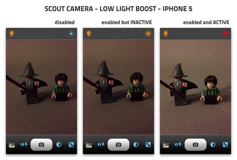
UPDATE: I’ve added full control over the iPhone 5’s low light boost mode to Scout Camera. The following image shows the low light boost button in the upper right corner – which allows you to switch low light boost on/off. The button turns red when low light boost is active, so you can tell exactly when your photos will be above ISO 800.
(I had to turn a lamp off to get the low light boost to come on, which is why there’s not much difference in brightness between the “inactive” and “active” examples.)
UPDATE: With iOS 7, Apple updated the Camera app to properly show an accurate preview. This article refers to the older version of the Camera app that was included in iOS 6.
The iPhone 5 is being delivered to people around the world today in a flurry of excitement. I’m expecting a knock on my door any moment as UPS delivers mine, and will happily start testing apps on it. Once I get some free time, I plan on taking lots of photos with it, as photography is a big hobby of mine (That love of photography is the reason I made Scout Camera).
I’m a bit puzzled by a design choice Apple has made with the Camera app on the iPhone 5 though:
When you take a photo on the iPhone 5, it’s saved to the camera roll in a 4:3 aspect ratio. Just like on the iPhone 4S, photos are 3264 pixels by 2448 pixels. However, unlike the iPhone 4S, the preview that’s displayed on the screen while you’re taking photos is in a 3:2 aspect ratio.
What this means, is that the final photo will look different than what you saw while taking the photo – with extra pixels on two sides. This image demonstrates the disconnect between what you see in the Camera app, and what you end up with in the final photo:
While some people won’t care, and may not even notice the difference – to me it’s a surprising design choice by Apple.
As a form of art, I think it’s important to be able to carefully compose a photo within the frame. To make sure that spacing of objects within the frame are evenly distanced from the photo’s edges. To take a well-designed photo from the start – rather than take a quick snap shot and find out that you need to crop it afterwards to get the photo you really meant to.
This is important stuff to photographers. DSLR camera makers for years have been trying to make what you see in a camera’s optical view finder match what you get in the final photo as closely as possible – with their most expensive cameras typically doing a better job of that than less expensive ones.
I’m guessing that Apple’s reasoning behind designing the app that way, was to keep the black toolbar at the bottom from being ridiculously large. If the Camera app previewed photos at the proper 4:3 aspect ratio, it might look similar to this:
It will be interesting to see how other camera apps handle this in the coming weeks. Will they follow Apple’s lead, and not preview the entire photo? Or design their interface to show the photo as it will look when saved?
While Scout Camera is already available in the app store, the update to add preliminary iPhone 5 support is still waiting for review from Apple. Here’s how it will display the full 4:3 photo on an iPhone 5:
Of course, Scout can also take photos in 3:2, 16:9 and 1:1 too:
There’s that knock on the door – my iPhone 5 has just arrived…
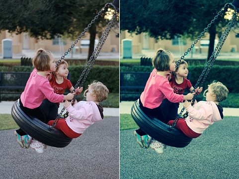
In preparation for SoFoBoMo, I’ve been reading up on different image processing techniques – things that give photos a certain look or style that sets them apart from simply fixing white balance, contrast and saturation. One popular technique is “cross-processing”, which involves processing film in a chemical solution intended for a different type of film – causing drastic shifts in color and contrast. The most common variation of this is processing color negative film in chemicals intended for slide film (C-41 as E-6).
For digital photographers, there are manytutorialsonline that show how to achieve similar results in Photoshop, mostly using simple curves adjustments.
Left: original image, Right: cross-processed in Photoshop by adjusting curves
However, I use Aperture (version 2) to manage my photo collection – and while I love Photoshop, I’d like to do as much as possible in Aperture in order to save on time and hard drive space. So, I set out to recreate the cross-processing technique in Aperture, which is somewhat problematic since it doesn’t have the same curves adjustments as Photoshop. Instead, you can do “levels” adjustments on the red, green and blue channels… but, as I discovered, you have to do quite a bit more tweaking in Aperture to get the same results. So, I created a levels preset in Aperture that results in images that pretty closely match what you’d get from following the aforementioned Photoshop tutorials.
Without going into too much boring detail, I did this by applying only the red channel adjustment to an image in Photoshop – then, with the same image in Aperture, adjusted the red channel levels until it matched what I was seeing in Photoshop. Then I did the same for the green and blue channels individually. Finally, I combined all three channel adjustments and compared the Photoshop version to the Aperture version for some final tweaking to make sure I got it right. Hardly a scientific process, and the match is far from perfect – but I think it’s close enough to be usable – especially considering the fact that the overall look of an image is very subjective anyways.
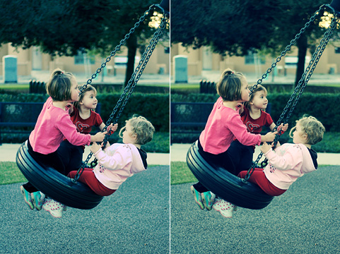
Left: cross-processed in Aperture, Right: cross-processed in Photoshop
I’d offer the preset as a download, but there doesn’t appear to be any way to import/export adjustment presets in Aperture… so, I’ll run through the exact steps required to create the preset here:
Step 1
In Aperture, select an image to cross-process and bring up the adjustments panel. You may want to make any necessary exposure adjustments now using the “Exposure” part of the adjustments panel… a badly underexposed image will still look badly underexposed after cross-processing.
Find the “Levels” portion of the adjustment panel. That is what you’ll be working with for this tutorial. If you’ve already made adjustments to the levels, you’ll want to reset them or choose a different image. Near the upper right corner of the Levels pane, is a button that has a rectangle with two vertical dotted lines running through it… click that button to show the “quarter-tone controls”:
Step 2 – Setting The Red Channel
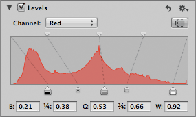
Select “Red” from the “Channel:” pulldown menu, and do the following steps in the order listed:
set B: to 0.21
set W: to 0.92
set G: to 0.53
set 1/4: to 0.38
set 3/4: to 0.66
at the top of the levels graph, drag the first triangle to the left about 2-3mm (the triangle whose line connects to the 1/4 point)… unfortunately there’s nowhere to enter a numerical value for this adjustment
Now your Red channel should look like this:
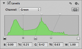
Step 3 – Setting The Green Channel
Select “Green” from the “Channel:” pulldown menu, and do the following steps in the order listed:
set G: to 0.42
set 1/4: to 0.25
set 3/4: to 0.63
Your Green channel should look like this:
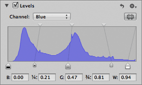
Step 4 – Setting The Blue Channel
Select “Blue” from the “Channel:” pulldown menu, and do the following steps in the order listed:
set W: to 0.94
set 1/4: to 0.21
set 3/4: to 0.81
Your Blue channel should look like this:
Step 5 – Saving The Preset
In the upper right hand corner of the “Levels” pane, click on the icon that looks like a gear and select “Save as Preset…”. Give your preset a name like “Cross-Process” and click the “OK” button. You now have a Levels adjustment preset you can use on any image – simply by clicking on the gear icon in the Levels pane and choosing “Cross-Process” (or whatever you named it). Your results may vary depending on the image, but it should get you in the ballpark and you can make adjustments as needed from there (the same goes for the Photoshop tutorial cross-processing techniques).
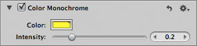
Step 6 – Taking It A Step Further
Some of the cross-processing tutorials suggest also adding a color layer to give the image more of a yellow or green tone. While there’s no exact match for doing this in Aperture, you can add a “Color Monochrome” adjustment for a similar effect. Choose something like a pure yellow with RGB values 255, 255, 0 for your color, and move the intensity slider to somewhere in the 0.2 range as shown here:
The difference between Photoshop and Aperture here, is that Aperture applies the adjustment as a color change – rather than simply overlaying the solid color like a “Normal” layer in Photoshop… which means that the effect won’t be as noticeable in dark areas of your image. You can compensate for this some by raising the “Shadows” adjustment in “Highlights & Shadows”.
If you like, also add some vignetting using Aperture 2’s new vignette adjustment.
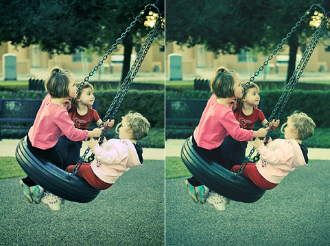
The Finished Product
Now your retro cross-processed masterpiece is complete, and you have a preset saved within Aperture to easily reuse the effect on any image you like. Here’s a comparison of the final images from Aperture and Photoshop after the color toning and vignetting are applied:
Left: final image in Aperture, Right: final image in Photoshop