Blog

Paperless Versus ‘Getting Things Done’

By far the strongest and most divided reactions I’ve gotten to Paperless have been over the fact that there’s no way to assign dates to list items.

Paperless was never intended to be a time based task manager like one of the many “getting things done” clones. I’ve tried a few of those and always felt like I was wasting a lot of time assigning and changing due dates as my priorities changed. It interfered with staying focused and actually getting things done.

With the types of projects I typically work on, I can’t often tell ahead of time how long something will take – and trying to predict an exact date/time when something will be completed is difficult at best. I’ll often also think of new things I need to work on for a project – which, if I were using a date-based solution would require all the other tasks to be shifted back in time.

So, in Paperless I took advantage of the iPhones built in method for reordering items in a table, and turned it into a simple way to re-prioritize items in a checklist. If something is important, I place it at the top of the list… and other less important tasks are pushed down. It’s quick and easy, and keeps me focused on finishing tasks rather than managing tasks.

Of course, I think there’s room for both ways of managing ones time. A date based solution is definitely better for keeping track of appointments and scheduling meetings… but for keeping track of tasks in a project where your priorities can suddenly change, I think Paperless is tremendously useful.

I like the way these app store reviews summed it up:

★★★★★
“Perfect as it is – After having tried a good deal of apps to get myself more organised – both free and paid – it is clear that this tops them all. Other apps presented a kind of novelty; I could fool myself into thinking that I was more organised, but it was never long before I abandoned them because it was obvious that they consumed unnecessary time. Paperless, however, has truly helped. It is streamlined, it is simple, it is sumptuous. I, for one, hope that you DON’T add clutter such as due dates and priorities because those frills can be bought and fought with elsewhere.”

★★★★★
“Simple, flexible, easy to use, and a real bargain – I buy a lot of task and notes apps. Most of them. And I try most of the free ones too. But few are as well designed, as simple, and as useful as Paperless. This application looks great, is perfect for making lists of all kinds, is flexible enough for tracking downs, can optionally display check boxes. And once you’ve worked through a list and have checked all the items, you can easily delete them. In short, if you have need for lightweight task and notes app, Paperless is for you. But you can also use in the app in conjunction with a full featured app, the one that tends to take longer to load and use.”

Paperless So Far – The Apple App Store

NOTE: I originally posted this article as a guest author on Bob Walsh’s “47 Hats” website. I’m reposting it here for posterity.

In the article “How to be a successful iPhone developer“, Bob Walsh offered some thoughts on why apps succeed or fail. As a developer who has had an app in Apple’s app store for a few months now, I thought I’d add to the discussion with some hard data and thoughts on what I think I’ve done right, and what I could be doing better.

Ten months ago, I decided to learn to make an iPhone app because I wasn’t satisfied with any of the to do list and notes apps in the app store. All of the ones I tried were too complicated, or didn’t offer the features I wanted. So, I bought a couple of books and started learning objective-c and the iPhone programming API’s. It started off as an experiment, but I discovered that I really like developing software for the iOS platform.

In March I released my first app “Paperless“, which is used to make lists and checklists. My goal was to make it flexible and easy to use… something that just about anybody could find a use for. I’ll spare you the sales pitch though – if you want to find out more you can read about it on my website.

The first couple of months were slow in sales due to the fact that I didn’t have much time for marketing, but the people who did find it were generally very positive about it and provided good feedback. Over time I’ve made improvements based on that feedback, and my user base has grown steadily.

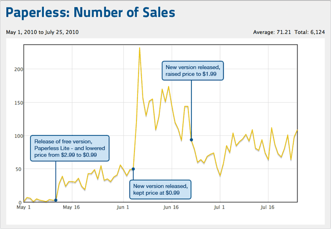
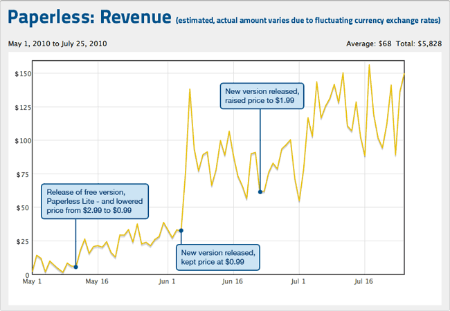
During May, I released “Paperless Lite”, a free version of the app to let people try it out before buying the full version. At the same time, I temporarily lowered the price of the full version to just $0.99 to generate more sales. Both of those things really helped, and after another small update 3 weeks later, I reached the number 3 spot in the Productivity category in the UK app store, and was doing okay in the U.S. app store as well.

User reviews have been overwhelmingly positive, and for most of July Paperless hovered around the #30 – #45 spot in the Productivity category in the U.S. At $1.99 per sale ($1.39 after Apple takes its 30 percent) that works out to around $100 – $150 a day. It’s not enough to meet my long term goal of being able to develop apps full time, but it’s a good start. A couple of Sundays ago, sales of my app brought in over $150 while I spent time with the family at the beach.

In the graphs below, you can see how offering the free version of Paperless helped to generate some sales – and how pricing adjustments have affected the number of sales and the income I’ve made. I can’t fully explain the first big spike on June 3rd. I released a new version then and that’s when it caught on in the UK. The popularity of it there only lasted a month, but luckily as sales in the UK dropped, sales in the U.S. picked up.

Paperless Sales
Paperless Revenue

What I’m Doing Right

Some people have said that the app store is like the lottery. That, in order to do well, you have to get lucky with Apple featuring your app or placing you in their “New and Noteworthy” or “Staff Favorites” category. While that would certainly help (a lot) – it isn’t something I’m relying on. What I AM doing is:

Trying to make apps that are functional, easy to use, and look great… it’s the Apple way and it’s what customers expect. Some apps try to do too much, which leads to a complicated and cluttered user interface. With Paperless, I think I’ve done a pretty good job at keeping it simple and attractive, while offering a lot of functionality.

Enjoying what I do, and creating things out of the love for doing it – not out of trying to make a quick buck. I care more about my product and my users experiences with it, than I do about making money. I figure that if I have a good product that people really find useful – then the money will come.

Listening and responding to customers needs. I have a “Feedback” button in my app so that people can easily email me if they need help or want to offer suggestions. I’m open with customers, and am genuinely interested in knowing what they think could be done better in Paperless – and they appreciate that.

Constantly making improvements. I know that Paperless isn’t perfect, and there are a few key features (landscape mode!) that need to be added. I have an FAQ to let customers know what features I plan on adding in a future release – or at least offer some reasoning behind why a specific feature isn’t there.

Creating a recognizable brand for myself, that people trust. A few customers have said they can’t wait to see what I come up with next. So, once I do make another app, I know that I’ll have some interest in it from the beginning.

Always learning new things. I’m constantly reading Apple’s documentation, iOS development books and watching video tutorials to try and expand my knowledge.

What I Could Do Better

So, those are the things I think I’m doing right – but what about things I could do better, or that I’m not doing at all? There aren’t enough hours in each day to do everything I would like, and here are the big things I’ve neglected:

The Cloud. Users don’t like their data stuck on one device. They want to be able to view and edit their information on their computer as well as their phone and possibly their iPad. Not every app needs this, but for something like Paperless the ability to sync and share information would be very useful. I’d love to build a web service that synced with Paperless, along with a Mac OS X app and an iPad version – but, as a one person shop doing this in my spare time, those things are going to take a while.

Localization. While my app is available for purchase in any of the Apple app store regions, I haven’t taken the time (or spent the money) to have features within the app translated to other languages. Translating it to the biggest 3 or 4 non-English speaking markets could potentially double my income.

Marketing. If I’m not relying on a featured spot by Apple, then the only way I’m going to gain more customers is by reaching out in other ways. I need to spend a lot more time letting people know about my app, and in a way that sets it apart from the hundreds of other list/todo/notes apps in the app store. With so many other developers vying for attention, it’s hard to get coverage for your app on many of the app review sites or tech related news sites. I’m going to have to find ways to reach outside of the online Apple community.

In Steve Jobs’ presentation on iOS4 in April, he stated that over 50 million iPhones had been sold. If you add the number of iPod Touches to that, it’s over 85 million. The 3 million iPads and 1.7 million iPhone 4’s bring the total of iOS devices out there to around 90 million. That’s a huge market, even if you consider that some people own more than one device.

If I sold Paperless at the current price of $1.99 to be installed on just one half of one percent of those devices, I’d make roughly $600,000 (before taxes).

Surely there must be a way? I’m working towards that, and feeling optimistic…

Cross-Processing In Aperture

In preparation for SoFoBoMo, I’ve been reading up on different image processing techniques – things that give photos a certain look or style that sets them apart from simply fixing white balance, contrast and saturation. One popular technique is “cross-processing”, which involves processing film in a chemical solution intended for a different type of film – causing drastic shifts in color and contrast. The most common variation of this is processing color negative film in chemicals intended for slide film (C-41 as E-6).

For digital photographers, there are many tutorials online that show how to achieve similar results in Photoshop, mostly using simple curves adjustments.

Left: original image, Right: cross-processed in Photoshop by adjusting curves

However, I use Aperture (version 2) to manage my photo collection – and while I love Photoshop, I’d like to do as much as possible in Aperture in order to save on time and hard drive space. So, I set out to recreate the cross-processing technique in Aperture, which is somewhat problematic since it doesn’t have the same curves adjustments as Photoshop. Instead, you can do “levels” adjustments on the red, green and blue channels… but, as I discovered, you have to do quite a bit more tweaking in Aperture to get the same results. So, I created a levels preset in Aperture that results in images that pretty closely match what you’d get from following the aforementioned Photoshop tutorials.

Without going into too much boring detail, I did this by applying only the red channel adjustment to an image in Photoshop – then, with the same image in Aperture, adjusted the red channel levels until it matched what I was seeing in Photoshop. Then I did the same for the green and blue channels individually. Finally, I combined all three channel adjustments and compared the Photoshop version to the Aperture version for some final tweaking to make sure I got it right. Hardly a scientific process, and the match is far from perfect – but I think it’s close enough to be usable – especially considering the fact that the overall look of an image is very subjective anyways.

Left: cross-processed in Aperture, Right: cross-processed in Photoshop

I’d offer the preset as a download, but there doesn’t appear to be any way to import/export adjustment presets in Aperture… so, I’ll run through the exact steps required to create the preset here:

Step 1

In Aperture, select an image to cross-process and bring up the adjustments panel. You may want to make any necessary exposure adjustments now using the “Exposure” part of the adjustments panel… a badly underexposed image will still look badly underexposed after cross-processing.

Find the “Levels” portion of the adjustment panel. That is what you’ll be working with for this tutorial. If you’ve already made adjustments to the levels, you’ll want to reset them or choose a different image. Near the upper right corner of the Levels pane, is a button that has a rectangle with two vertical dotted lines running through it… click that button to show the “quarter-tone controls”:

Step 2 – Setting The Red Channel

Select “Red” from the “Channel:” pulldown menu, and do the following steps in the order listed:

  1. set B: to 0.21
  2. set W: to 0.92
  3. set G: to 0.53
  4. set 1/4: to 0.38
  5. set 3/4: to 0.66
  6. at the top of the levels graph, drag the first triangle to the left about 2-3mm (the triangle whose line connects to the 1/4 point)… unfortunately there’s nowhere to enter a numerical value for this adjustment

Now your Red channel should look like this:

Step 3 – Setting The Green Channel

Select “Green” from the “Channel:” pulldown menu, and do the following steps in the order listed:

  1. set G: to 0.42
  2. set 1/4: to 0.25
  3. set 3/4: to 0.63

Your Green channel should look like this:

Step 4 – Setting The Blue Channel

Select “Blue” from the “Channel:” pulldown menu, and do the following steps in the order listed:

  1. set W: to 0.94
  2. set 1/4: to 0.21
  3. set 3/4: to 0.81

Your Blue channel should look like this:

Step 5 – Saving The Preset

In the upper right hand corner of the “Levels” pane, click on the icon that looks like a gear and select “Save as Preset…”. Give your preset a name like “Cross-Process” and click the “OK” button. You now have a Levels adjustment preset you can use on any image – simply by clicking on the gear icon in the Levels pane and choosing “Cross-Process” (or whatever you named it). Your results may vary depending on the image, but it should get you in the ballpark and you can make adjustments as needed from there (the same goes for the Photoshop tutorial cross-processing techniques).

Step 6 – Taking It A Step Further

Some of the cross-processing tutorials suggest also adding a color layer to give the image more of a yellow or green tone. While there’s no exact match for doing this in Aperture, you can add a “Color Monochrome” adjustment for a similar effect. Choose something like a pure yellow with RGB values 255, 255, 0 for your color, and move the intensity slider to somewhere in the 0.2 range as shown here:

The difference between Photoshop and Aperture here, is that Aperture applies the adjustment as a color change – rather than simply overlaying the solid color like a “Normal” layer in Photoshop… which means that the effect won’t be as noticeable in dark areas of your image. You can compensate for this some by raising the “Shadows” adjustment in “Highlights & Shadows”.

If you like, also add some vignetting using Aperture 2’s new vignette adjustment.

The Finished Product

Now your retro cross-processed masterpiece is complete, and you have a preset saved within Aperture to easily reuse the effect on any image you like. Here’s a comparison of the final images from Aperture and Photoshop after the color toning and vignetting are applied:

Left: final image in Aperture, Right: final image in Photoshop