Paperless 2.1.2 Released

Paperless version 2.1.2 is now available. In addition to the many improvements from Paperless 2.1, this release has a few small additions – plus some important improvements and bug fixes related to syncing.

What’s New

  • You can now sign up for the Crush Apps newsletter directly from the app (on the settings screen)… I’m working on something big, and want you to be the first to know about it.
  • A few people disliked the change that made new lists appear at the top, so there’s now an option in the settings to have them go to the bottom.
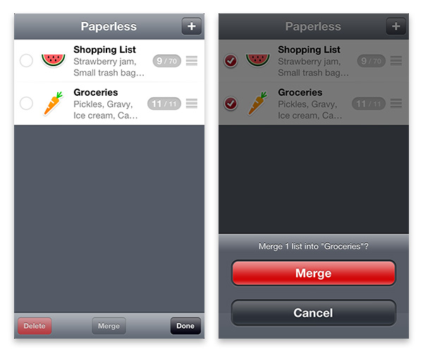
  • When you import a list from email, if there is an existing list with the same name, you’re now given the option to merge the two lists or import it as a new list.

Improved Syncing

  • This release eliminates the possibility of conflicted/duplicate copies of lists. Now when there’s a syncing conflict it happens on the item level. In all cases, Paperless preserves information… so, at worst, you may end up having a list item you previously deleted reappear, or two slightly different copies of a list item.
  • When you first sync a device, if there is a list on that device with the same name as a list already on Dropbox, the two lists are automatically merged.
  • Now if you unlink from Dropbox with the “Keep Lists And Unlink” option and then relink to that same Dropbox account, it no longer results in duplicate copies of lists.
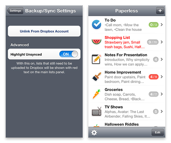
  • Plus many other syncing related bug fixes and improvements. (Like letting you know when your Dropbox account is full.)

New URL Schemes

In addition to the URL schemes from the 2.1 update, there are two new ones:

If you’re using an app like Launch Center Pro, and want to open Paperless to a specific list, you would use this:

paperless://viewList?
	listName=YOUR_LIST_NAME

(note that if there are spaces in the list name, you’ll need to replace those with “%20”. For example, if your list name is “My To Do List”, you would use “My%20To%20Do%20List”)

Add multiple items to a specific list:

paperless://addItems?
	toListNamed=YOUR_LIST_NAME
	&listItems=ITEM_NAME1%0DITEM_NAME2%0DITEM_NAME3%0DITEM_NAME4

If there is no list with that name, it will automatically be created. If you don’t specify a list name, it will create a new list named “Untitled”.

You can also add optional parameters for the icon name, whether or not it’s a checklist, and whether or not new items should appear at the top of the list (if the list already exists, it will ignore them… it’s only used if the list hasn’t been created yet):

paperless://addItems?
	toListNamed=YOUR_LIST_NAME
	&isCheckList=YES
	&itemsToTop=YES
	&iconName=NAME_OF_ICON
	&listItems=ITEM_NAME1%0DITEM_NAME2%0DITEM_NAME3%0DITEM_NAME4

… and yes, this does make the previous addItem and addList URL schemes redundant, but they still work if you happen to be using them.

Paperless 2.1 Released

Paperless version 2.1 is now available in the App Store. This release adds a few new features, along with many subtle improvements and bug fixes. Here’s a list of the new features with details on how to use them:

Now includes over 450 icons

Including many that were requested by people who have purchased the app.

New icons

Select multiple lists to merge or delete

On the main screen, when you tap the “Edit” button, you can now select multiple lists to either delete or merge.

When selecting lists to merge, note that the first list you select is the one that lists will be merged into.

Merging Lists

Select multiple list items to move, copy or delete

When viewing a list, you can press the “Edit” button and select multiple list items to move, copy or delete. When deleting multiple items, whether or not you get a confirmation asking if you really want to delete the items depends on what you have the “Warning On Item Delete” switch set to in the app’s settings.

Selecting Multiple Items

Syncing: lists viewed from the Dropbox website are now pretty

When using the “Automatic Backup And Syncing” feature in Paperless, your lists are saved to your Dropbox account in a folder named “Paperless”. Each list is saved as a separate file ending in “.xml”.

Previously, if you viewed one of those XML files on the Dropbox website you’d see the raw XML code. However, now a style sheet has been added so that the list is nicely formatted for viewing. NOTE: You’ll need to modify the list in Paperless to make this change take effect (a new XML file has to be written to Dropbox).

You can also print the lists from the Dropbox website, but note that when printing a checklist you’ll need to do the following:

Safari – make sure the “Print backgrounds” option is selected

Firefox – make sure both the “Print Background Colors” and “Print Background Images” options are selected

Syncing: option to show lists that need to be synced in red text

There is a new option in the “Automatic Backup And Syncing” settings to “Highlight Unsynced”. With that feature turned on, lists that still need to be uploaded to Dropbox will be shown in red text on the main screen.

This should be useful to people who frequently use Paperless in areas with a poor wifi/cellular connection – as it will let you know if a list was unable to be uploaded. Then, once you’re somewhere with a good connection again, you can simply open Paperless and the list should automatically be uploaded (at that point the red text will change back to the normal colors).

Highlight Unsynced feature

Add an item or list via URL schemes

You can now add a list item or an entire list from certain other apps (like the popular app Drafts) by using URL schemes.

NOTE: in the examples below I’ve added spacing to make them easy to read… but in actual use you need to remove all spaces/returns.

To add a list item, the format of the URL scheme is:

paperless://addItem?
	itemName=YOUR_ITEM_NAME
	&itemNote=YOUR_ITEM_NOTE
	&toListNamed=YOUR_LIST_NAME

Both the item note and the list name are optional.

If you don’t specify a list name, the item will simply be added to the first list in Paperless. If you specify a list name that doesn’t exist, a new list will be created with that name.

To add an entire list, the format of the URL scheme is:

paperless://addList?
	listName=YOUR_LIST_NAME
	&isCheckList=YES
	&itemsToTop=YES
	&iconName=NAME_OF_ICON
	&listItems=ITEM_NAME1%0DITEM_NAME2%0DITEM_NAME3%0DITEM_NAME4

Everything but the list name is optional. Also note the %0D characters between each list item… that’s the equivalent of a carriage return. It looks complicated, but if you’re using something like Drafts, once you enter the URL scheme (or “URL Action”) it’s a breeze to use.

For those of you who use Drafts specifically, here are some possible URL Actions:

Item To Paperless

paperless://addItem?
	itemName=[[draft]]
	&toListNamed=Drafts

List To Paperless

paperless://addList?
	listName=Untitled
	&itemsToTop=YES
	&iconName=Folder%20-%20Add
	&listItems=[[draft]]

Checklist To Paperless

paperless://addList?
	listName=Untitled
	&isCheckList=YES
	&itemsToTop=YES
	&iconName=Folder%20-%20Add
	&listItems=[[draft]]

Named Checklist To Paperless (the first line of text is used for the list name)

paperless://addList?
	listName=[[title]]
	&isCheckList=YES
	&itemsToTop=YES
	&iconName=Folder%20-%20Add
	&listItems=[[body]]

See also: instructions on how to create a URL Action in Drafts.

Other improvements

  • new lists are now added to the top
  • improved search – if you search starting from the main screen, that search term is carried over into the list view
  • when using the “Import Items” feature, unnecessary dashes/bullet points are removed
  • fixed a rare but extremely frustrating problem on an iPad where the main screen of lists could be shown partially offscreen

I hope you find these new features useful!

Why Scout Camera?

Prior to writing her review of Scout Camera, Marianne Schultz of AppShopper asked me “Why did you want to create a photography app (given the large number of photography apps already in the App Store)?”

This post is an expanded version of my response to her, explaining why I made Scout Camera – and why I think it makes for a better photography experience.

I love photography… so much that at one point I strongly considered becoming a professional photographer, but quickly realized that it would require too much time away from my family. Though I’m not a very prolific photographer, I think I do occasionally take a decent photo.

Given that love of photography, it was natural for me to want to make a camera app.

I really enjoy the process of taking photos – and being able to frame a picture to a particular aspect ratio while taking it is, to me, a better experience than taking a photo and cropping it later on. If you carefully compose a picture while in the process of taking it, rather than taking a quick shot and cropping it later, you’ll end up with better photos – and you’ll become a better photographer overall. I think this is something most photography enthusiasts would agree with me on. For that reason, I wanted to make a camera app that offered a choice of aspect ratios.

I also really like the 16:9 aspect ratio. I find that particular shape of photo visually interesting, and wanted a camera app capable of that. Years ago, I discovered some fantastic 16:9 photos on the DPReview.com forums taken by photographer/architect Björn Utpott with his Panasonic LX1 camera – so my desire for a 16:9 camera app was also partially inspired by him. (I wish these photos were still around, but I can’t find them anywhere… his newer photos are taken with various cameras and mostly not in 16:9, but are still great). The ability to take photos in 16:9 ended up working well with the iPhone 5 when it was released – it’s nice viewing those photos on the iPhone 5’s 16:9 screen.

A 16:9 photo taken with Scout Camera

One issue I have with other camera apps is how some of the controls block the view of the photo you’re trying to take (like the typical front/back camera switch and flash on/auto/off buttons). In other camera apps, I find those controls distracting and think they get in the way of composing the picture. So, with Scout Camera I decided to make those controls only show when you need them.

Another problem with certain camera apps is how they try to look like traditional cameras and emulate their controls. I wanted something with a clean, uncluttered interface – something elegant that looked like it belonged on an iPhone, not a poorly translated rehash of DSLR buttons and menus.

Scout Camera 
Scout Camera’s clean, uncluttered interface.

I also wanted to be able to offer something that allowed you to take photos in black and white, or that had a little extra color saturation – or a number of other visual looks… and I wanted to be able to see what those effects looked like as I was taking the photo. There are some really great image filters included with Scout Camera, and there’s still a lot more I want to do in that area.

In many ways, I think Scout Camera makes the process of taking photos more enjoyable, and can even help you take better photos. While the app runs on anything from an iPhone 3GS on up, it really shines on an iPhone 5. In fact, I think it’s the best photography experience available on the iPhone 5 and I hope you’ll give it a try.

The iPhone 5’s Low Light Boost Mode

Yesterday Daring Fireball’s John Gruber reported his findings that Apple’s built in Camera app on the iPhone 5 was capable of using ISO speeds up to 3200 – while 3rd party apps seemed to be limited to ISO 800.

This was troubling news, and I reached the same conclusion in my own testing.

However, after posting a thread (developer login ID required) to the Apple developer forums I’ve learned that 3rd party developers CAN take advantage of this special “low light boost mode”. (Thanks Apple!)

While it’s not documented yet in the AVCaptureDevice Class Reference, taking a peek at the “AVCaptureDevice.h” class header reveals the related properties:

lowLightBoostSupported
lowLightBoostEnabled
automaticallyEnablesLowLightBoostWhenAvailable

They chose to make the low light boost mode optional, as the increase in light sensitivity comes at the cost of some increased noise (not surprisingly). Making it optional was a good decision.

While this low light boost mode won’t make it into the update of Scout Camera that is currently “waiting for review” by Apple – I’ll be looking at implementing it for the next update.

UPDATE: I’ve added full control over the iPhone 5’s low light boost mode to Scout Camera. The following image shows the low light boost button in the upper right corner – which allows you to switch low light boost on/off. The button turns red when low light boost is active, so you can tell exactly when your photos will be above ISO 800.

(I had to turn a lamp off to get the low light boost to come on, which is why there’s not much difference in brightness between the “inactive” and “active” examples.)

With The iPhone 5’s Camera App, What You See Is Not What You Get

UPDATE: With iOS 7, Apple updated the Camera app to properly show an accurate preview. This article refers to the older version of the Camera app that was included in iOS 6.

The iPhone 5 is being delivered to people around the world today in a flurry of excitement. I’m expecting a knock on my door any moment as UPS delivers mine, and will happily start testing apps on it. Once I get some free time, I plan on taking lots of photos with it, as photography is a big hobby of mine (That love of photography is the reason I made Scout Camera).

I’m a bit puzzled by a design choice Apple has made with the Camera app on the iPhone 5 though:

When you take a photo on the iPhone 5, it’s saved to the camera roll in a 4:3 aspect ratio. Just like on the iPhone 4S, photos are 3264 pixels by 2448 pixels. However, unlike the iPhone 4S, the preview that’s displayed on the screen while you’re taking photos is in a 3:2 aspect ratio.

What this means, is that the final photo will look different than what you saw while taking the photo – with extra pixels on two sides. This image demonstrates the disconnect between what you see in the Camera app, and what you end up with in the final photo:

Photos taken with the iPhone 5 Camera app are larger than what you're shown in the app's preview area

While some people won’t care, and may not even notice the difference – to me it’s a surprising design choice by Apple.

As a form of art, I think it’s important to be able to carefully compose a photo within the frame. To make sure that spacing of objects within the frame are evenly distanced from the photo’s edges. To take a well-designed photo from the start – rather than take a quick snap shot and find out that you need to crop it afterwards to get the photo you really meant to.

This is important stuff to photographers. DSLR camera makers for years have been trying to make what you see in a camera’s optical view finder match what you get in the final photo as closely as possible – with their most expensive cameras typically doing a better job of that than less expensive ones.

I’m guessing that Apple’s reasoning behind designing the app that way, was to keep the black toolbar at the bottom from being ridiculously large. If the Camera app previewed photos at the proper 4:3 aspect ratio, it might look similar to this:

It will be interesting to see how other camera apps handle this in the coming weeks. Will they follow Apple’s lead, and not preview the entire photo? Or design their interface to show the photo as it will look when saved?

While Scout Camera is already available in the app store, the update to add preliminary iPhone 5 support is still waiting for review from Apple. Here’s how it will display the full 4:3 photo on an iPhone 5:

Of course, Scout can also take photos in 3:2, 16:9 and 1:1 too:

There’s that knock on the door – my iPhone 5 has just arrived…